
Put income, spending and savings on one screen that explains itself
A personal finance tracker where income, spend by category and plain-language insights sit next to the everyday jobs: freeze a card, send money, check what cleared.
The problem
Most people can see their balance and cannot see their money. A bank app shows a number and a list of transactions, and turning that into an answer to "where did it go this month" means exporting a statement, sorting it into categories by hand and adding things up in a spreadsheet, if it happens at all. The everyday jobs, freezing a lost card, sending money to a friend, checking whether a payment has cleared, live in different corners of the app from the numbers they affect.
What it cost
For the person, the cost is decisions made blind: spending that only gets noticed once it has already happened, and savings that never get set aside because nothing ever said there was room. For the product, it is engagement that stops at the balance check, because there is nothing on the screen worth coming back for.
What we built
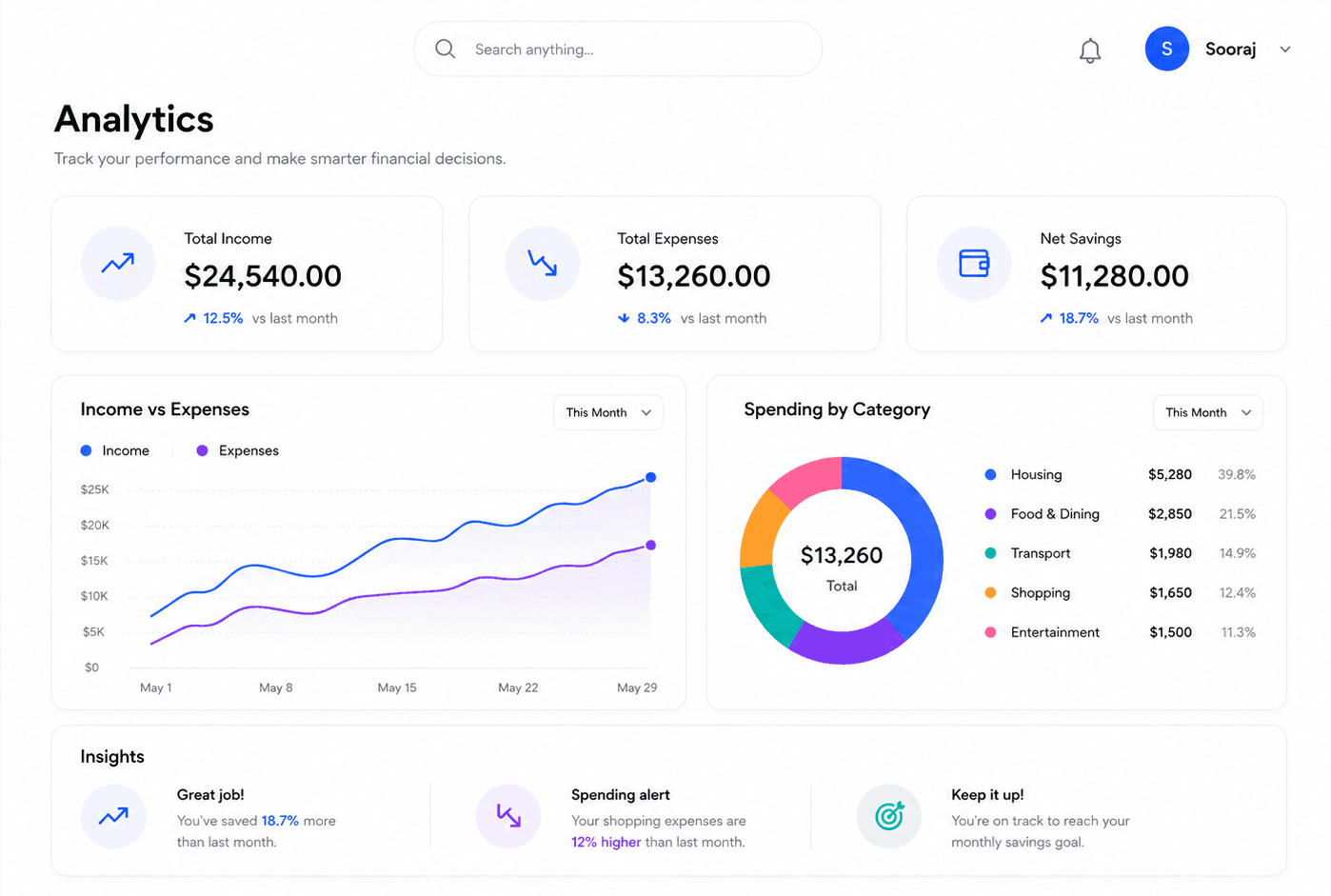
WireFin, a personal finance tracker where the numbers mean something. The analytics screen leads with three headline figures, total income, total expenses and net savings, then shows income against expenses over time and spending broken out across five categories. Beside the charts sit insight cards written in plain language, so a spike in a category is a sentence rather than a slice of a donut.
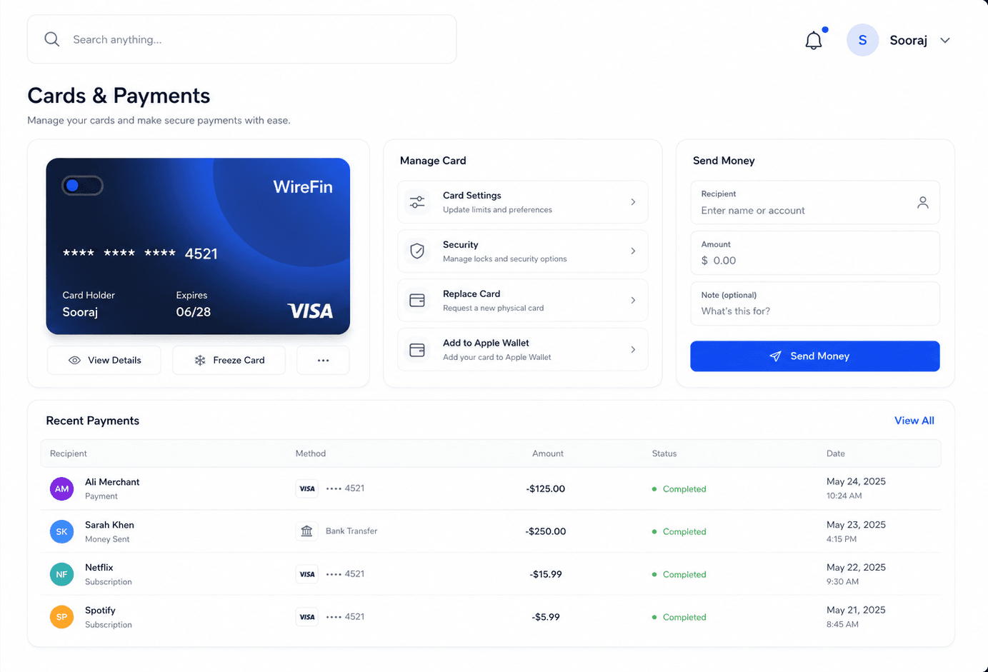
The same product carries the everyday jobs. A cards screen shows the virtual Visa card with its management controls, so freezing it is one tap, not a phone call. A send-money form and a recent payments table sit alongside, so what just cleared is visible next to the button that moved it. Ten modules in all, sharing one design system, so the analytics and the actions read as a single product rather than a dashboard bolted onto a wallet.
The three headline figures sit directly above the charts that explain them, so the total at the top and the breakdown beneath it are read together rather than hunted for. The income-versus-expenses chart runs over time, which is how people actually budget, and the category donut uses five buckets a household recognises rather than the long tail of merchant codes a bank produces. Every screen, from the analytics to the card controls, is clear on a wide screen and works on a phone without hiding anything.
Stack
- Next.js
- TypeScript
- Charting
- Card issuing and payments API